Following the “less is more” rule is critical when designing your brand because the foundation of graphic design is communication. Giving your design space to breath allows you to present your brand to the consumer in a visually pleasing way. Many designers think the object is to fill the page or to leave no space unused. In general that is not conducive to good design. What is left out is often just as, if not more, important than what is left in.
When deciding how to design your website, your logo, your marketing and/or your collateral you must consider the following: What is the message you are trying to convey? What elements communicate that message easier than others? How much content is necessary to convey your message? What colors and fonts best represent your message and style?
Limit Distractions
Noisy and over-designed pieces just create too much stimulus for people to digest. There are so many campaigns, ads and promos competing for our attention. That is why minimalist designs win! It is refreshing (and unexpected) so it causes individuals to pause and hang out for a minute; that is one extra minute your competition does not get! Be unique and creative but do all of these things without too many bells and whistles. Your brand and its design need to stand on its own merits without loud pomp and circumstance. You do not want to create confusion with non-essential “information”.
Use of White Space
White space or negative space is the space between design elements. On a macro level it is the space around your design and the large blocks of empty space between elements. On a micro level it is the space between two lines of text or the space between an image and its caption.
Filled space sits in opposition to negative space, but neither exists without comparison to the other. Both are necessary to create a harmonious balance in a design. When all your design elements crowd each other it is hard to find your way through them to any one element. White space gives organization to those elements and provides visual relief. Allowing the elements of your design to breathe makes it easier for visitors to absorb your content.
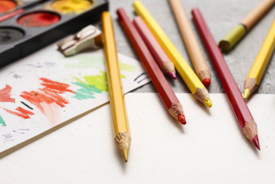
Embrace Color
Color is used to evoke emotion and express personality. It stimulates brand association and accelerates differentiation. In marketing and branding, colors are perceived in such distinct ways that there is a whole color “psychology” theory surrounding it. Feelings and emotions that are triggered and translated from a color are based on personal experiences, societal norms and culture. Sixty percent of the decision to buy a product is based on color!
Primary color palettes should consist of 3-5 colors that are utilized throughout your logo and marketing materials and be selected strategically based on your brand’s values. You should choose colors based on where and for what the color is being used and how you want consumers to feel when seeing your design.
Be Purposeful
Have intention with your design. Defy convention. Think outside of the box. Do the unexpected. You want your brand’s design to be remembered for being different. Being different is typically always better than just being better or faster or cheaper than your competition.
All great designs have intention behind them. They are an expression of the brand promise, therefore, your identity should have meaning behind it. Good design is good design, but great design is often measured by the intention behind the design.
Being simple is difficult. Simplify, Simplify, Simplify. Minimalist design techniques can create a Zen-like environment in an already cluttered 24/7 world. Your design style should translate your brand and positioning without the need for much fanfare. Keep your messaging short, simple, and easy to decipher; doing so will prevent consumers from feeling frustrated and annoyed, and may ultimately convert them into returning customers.