In my book MOO-LAH-GY, I talk about the importance of typography. One of the illustrations I use to get my point across is a cute quote I found that says, “I’m silently judging your font choice.” I love it because it’s a humorous way to articulate that something as simple as typography can immediately elicit an emotional response. How? Well, if the font is childlike and the company focuses on technology, there will be a disconnect for the reader. If a progressive, innovative company uses a serif font (the typography with the tips on the end of each letter), the audience would question that in their mind because a san serif would be more appropriate. When fonts are used correctly, it’s like a verbal symphony.
Typography is a crucial part of the design, but ironically, it is usually not well thought out. You can create brilliant illustrations, photos and other graphic content but if the typography on your website or in your branded assets is less than rocking, it could easily turn a reader away.
When talking about typography, I don’t mean just choosing and using a font, I am talking about arranging all typographic elements in your design, the visual hierarchy, the contrast, the whitespace, the font choice and font size. All typographic elements affect your design on both a micro and macro level.
Simply put, typography is the style and appearance of text. When a company is designing a brand identity, a consistent set of fonts must be used—each with a specific purpose. Typography lets you create a certain atmosphere and have a personality. You can be modern, vintage, romantic, shy or tough just by choosing right typeface and arranging it correctly. Work with your type so you can express your identity.
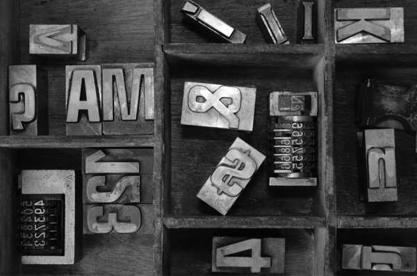
Fonts should be legible. They are needed for headings, titles, subtitles, and body text in any collateral—and online. Consider the weight and size of each font, in addition to the style. Serif fonts (the ones with the little tails) are easy to read and are considered more formal. Sans serif fonts (the ones that are “cleaner,” without anything hanging off the ends of the letters) are more modern and come in a variety of thicknesses, styles, and lengths.
When choosing your fonts, you have to decide whether, when put together, the different fonts are harmonious with one another. Make sure they are different from your competitors and translate the personality of your brand. And, most importantly, they have to be easy to read—nobody likes invitations (to events, or to a new company) that require squinting to read.
Header fonts should stand out the most, as they are the most important. Often, people boldface, capitalize, underline, or increase the font size to make headings pop.
Titles should be the next text a reader sees. This font should complement the heading, but not overpower it. Consider using a slightly thinner font that is a pinch smaller in size.
Subtitles are next. Follow a similar hierarchy when choosing different levels of subtitles as you did with the first two points, and think about italicizing the font or making it smaller in size than primary headers and titles.
Body text is the last thing to stand out. It is crucial that body fonts are easy to read and one of the smallest in size. One important thing to note in body text is insuring consistency. Some people want to emphasize words by putting them all in caps and bold facing them so they stand out. Often times, that is perceived by the reader as shouting, so be careful when attempting this.
At the end of the day, typography can help you engage readers, guide them, and ultimately persuade them when choosing (and using) strategically. When in question, ask an expert because, they’ll be secretly judging your font choice anyway! Happy writing!